Moodboards can help you plan, create, clarify and connect your styling and photography for one shot, a days shoot or across an entire brand.
Whether you create them digitally on something like Pinterest, on here with our moodboard feature to collate backdrops for your shoots or physically with magazine tears and swatches, moodboards can be highly effective in helping you develop ideas and make an initial, visual plan.
And lets not overlook the focus and efficiency having a visual reference can bring to each step of your creative process – it will help keep you on track; clarifying your aims and speeding up decisions.
A moodboard is like a mini creative brief; if you’re shooting for your own content a moodboard might be all you need to develop an idea and set the style and tone for your shoot.
If you’re working on a styling or photography job for a client, a moodboard may be the first step in showing them that you understand their ideas and aims before developing a more in-depth production plan or shot list.
I tend to use Powerpoint to create my moodboards (that probably makes me middle-aged?!) as I find it easy to screengrab things and plonk them on there, moving things around and resizing, adding text notes and my own images easily.
I know other creatives use Canva but it’s not something I’ve ever got to grips with (It looks great but I was very lucky to grow up with all the Adobe creative software available to me so haven’t needed to delve into Canva).
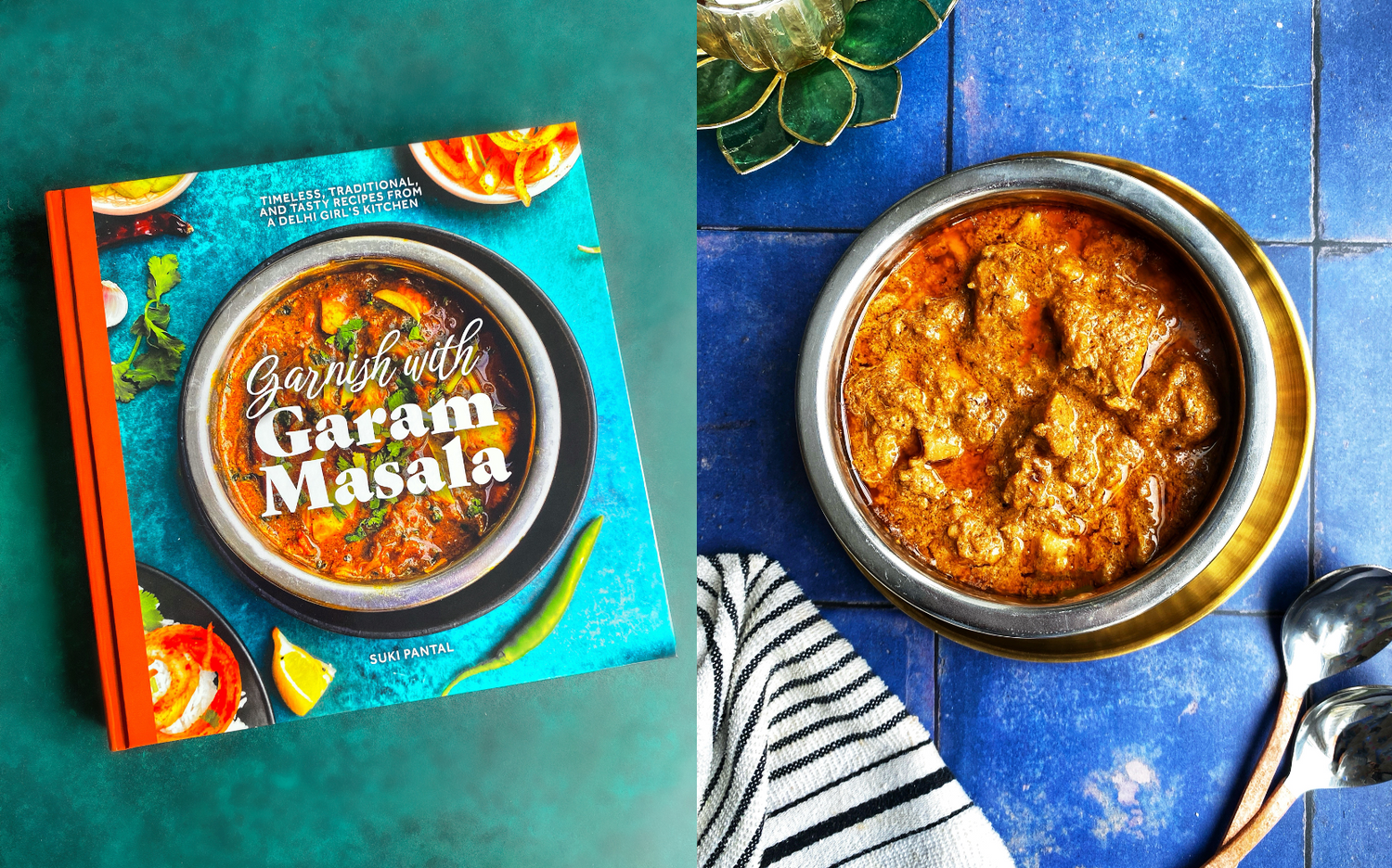
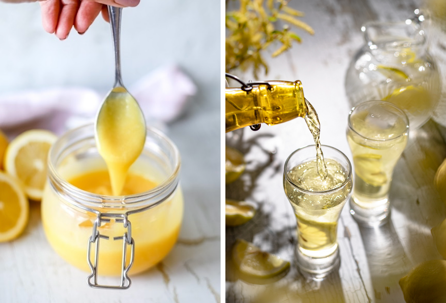
Sometimes I’ll create physical moodboards on paper or like shown here, with actual backdrops, props and products, then shoot it with my phone to send to a client or keep as a rough 'sketch' to develop further later.
Like many stylists and photographers, when I plan a shot (or series of shots) I research around the product or food and think about everything that I want to include to tell the story so the image connects with my audience.

Moodboards (or inspiration boards) for photography can include -
- Examples of the kind of light and mood you want to achieve in as similar setting as possible (this can take lots of research on Instagram and Pinterest but it really helps speed things up when setting up kit and lights)
- An image of the food or product shot at the angle you’ve decided is best to craft your story – everything else in this image can be completely 'off-brand' and I often greyscale them so they aren’t distracting to the overall theme.
- The scale of the product/food in the image – does it fill the frame or sit in just 1/5 of the space? Again this leads to other decisions and is best decided early, along with…
- The aspect/crop of the image – is it 4/5 IG portrait, 1/1 square, landscape as shot, a letterbox web banner etc.
These two points I would communicate on a moodboard by including a sketch of the aspect and scale of the main dish/product within it.
- Food references – brilliant examples of food styling that you hope to recreate. This might be an overall dish or a small detail like glistening condensation on a cold beer can.
- Colours – this can be anything that represents the colours you want to use – inspiring travel images, a nail varnish you love, paint/print colour swatches, a piece of stone, an art deco painting – whatever inspires you. Don’t limit yourself to the industry you’re in or the product/food you’re shooting when looking for inspiration on any of these points.
- Prop ideas – ceramics, linens, cutlery, foliage, gathered treasures, ingredients, tools – these might be screengrabs from the shops you can buy them from or phone pics of your own props.
- Descriptive words – I use these a lot in my commercial styling and coaching work because I find there can be different interpretations that can cost a lot of time if you’re not careful. Is what I see as editorial the same as what you see? Does ‘lifestyle’ mean the same to all of us? Whats the level of 'relaxed' everyones comfortable with?
Adding any industry buzz words that come up in conversations to a moodboard presentation gives you the chance to clarify expectations and add visual checkpoints. Iron these out early on in the process to avoid frustration!
- Expand – if you think anything needs further info to capture the essence of what you want to say, expand it in writing. Mixing text and images really helps refine a direction.
- And if you are creating something to present or collaborate on with a client, always include your logo and theirs – it protects your work to some degree and you never know who else might see it and love what you do.
Read more styling tips:
5 backdrops perfect for beginners
Playing with colour theory in food styling
Getting started with our printed photography backdrops
The power of props: elevate your content & craft stories through styling


12 comments
I love the moodboard feature on your site and have actually used it to help decide on my last couple of purchases. As I often have to use two backdrops together to create a faux table/wall scene, seeing colours and textures together helps me decide if the colourways work well together or not. I had never thought to greyscale images in my own moodboards that are distracting to the colour theme but helpful for lighting, etc – great tip!
Another great post. Love your posts and business. Amazing customer service and incredible backdrops! So glad I found you!
You are always so generous in sharing your expertise, would love one of your backdrops to play with my product shots 😀
Love your blog Sophie! And love these tips. Your backdrops have honestly transformed my photography and I can’t wait to keep building my collection from you. Thank you so much!
I’m going to use this for my next shoot! Even if it’s a personal project, I find most of my shoots go wasted if I don’t plan the colour scheme of the bagkground and props. This is a really great tip and feature !